4 Things You Need to Know About Branding Your Therapy Website
(Plus, Where to Find Good Stock Photos That Don’t Feel Cheesy)
When you’re setting up your therapy website, it’s easy to get overwhelmed with all the choices—fonts, colors, logos, images… all the “branding stuff.” But good branding doesn’t mean being flashy or trendy. It means creating a visual presence that feels like you—clear, grounded, and welcoming.


Here are four things I think every therapist should know about branding their website:
1. Branding is more than a logo
I know, I know—it’s tempting to start by picking a logo. But branding is really the full vibe of your site. It includes how your words sound, how your photos feel, and how your colors create mood. You want people landing on your homepage to feel like they’ve already taken a deep breath
So instead of asking, “What colors are popular right now?” ask: “What do I want someone to feel when they find me online?”
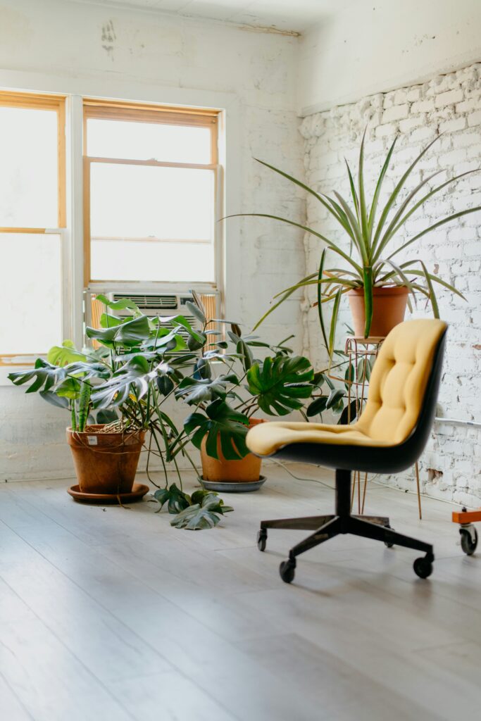
2. You don’t have to use your headshot on every page
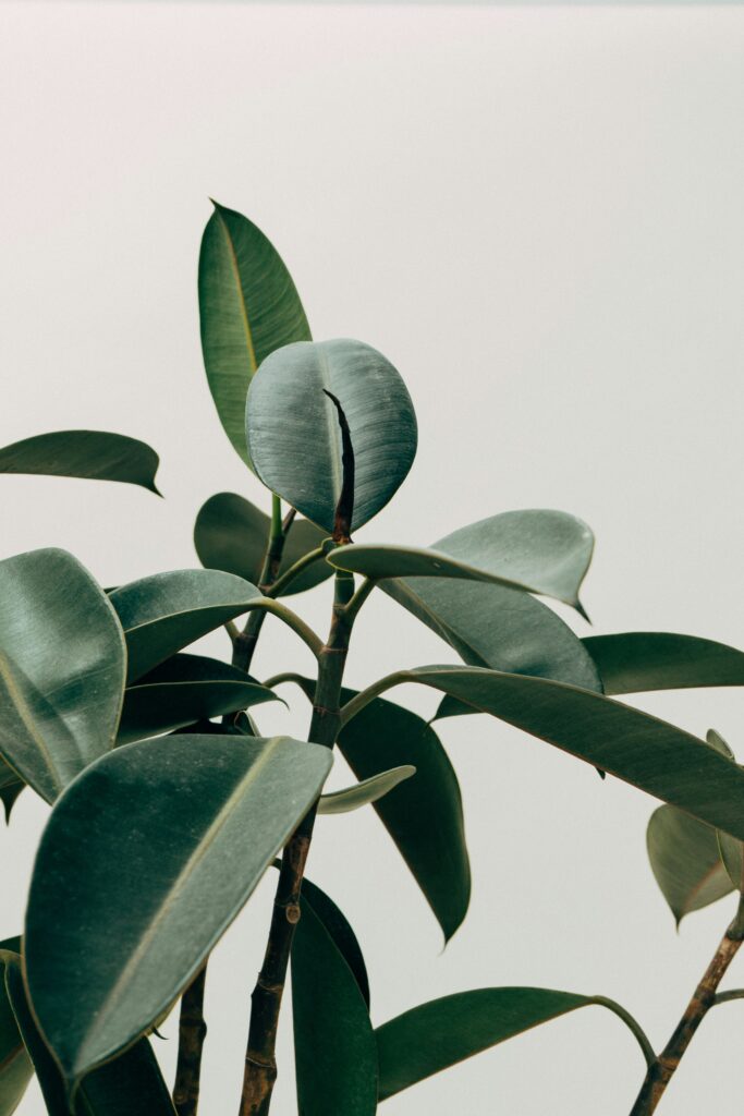
Let’s be real: therapy websites can get very headshot-heavy. While it’s great to show your face, you can also use imagery that reflects your approach—calm nature scenes, meaningful objects, soft textures. It makes your site feel more spacious and less like a LinkedIn page.
Just be thoughtful about your image choices. Avoid generic stock photos of people shaking hands or staring off into space—they don’t say much. Go for photos that create mood.
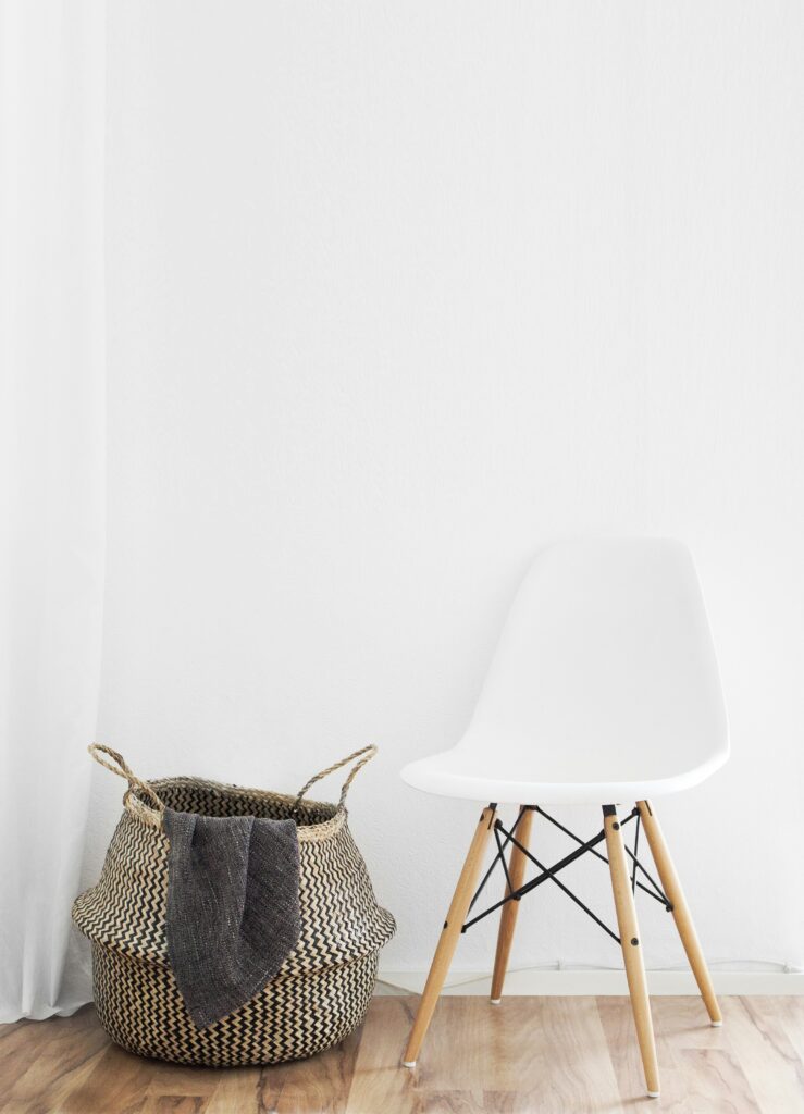
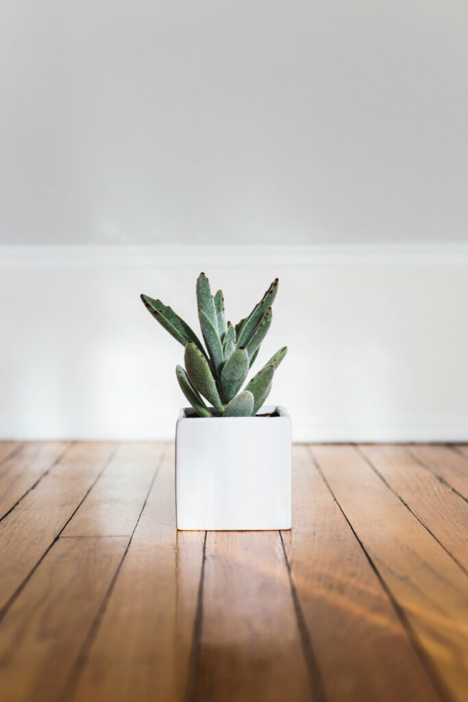
3. You need a color palette that supports—not distracts
Your colors should soothe, not shout. A palette of 3–5 tones is enough. Think about natural hues that reflect the energy of your work—maybe muted greens, warm neutrals, or soft blues. Bright reds or electric purples might be fun, but they don’t always make sense for a space meant to feel safe and grounded.
You don’t need to be a designer to get this right. Stick to tones that feel like your office space would.
4. Stock photography doesn’t have to feel… stocky
The trick is finding photos that feel real, not staged. Here are a few favorite places to download imagery that doesn’t scream “corporate brochure”:
- Styled Stock Society – minimal, calming, and curated
- Sourced Co – originally for wedding pros, but great for soft, authentic vibes
- Unsplash – free and full of beautiful nature shots
- Haute Stock – feminine, neutral-toned, not overly styled
- The SC Stockshop – some professional, clean options if you dig a more modern feel
Pro tip: Keep a folder of your favorites so you don’t have to hunt every time you’re updating your site or writing a blog post.


Bottom line?
Your branding doesn’t have to be complicated or loud. It just has to feel like you. And if you’re creating a space for people to land and feel seen, you’re already doing it right.


